Wow, where do I start? My head is swimming with art business thoughts and to-do lists since returning from the two day conference. Pile on top of that I will teach 120 kids art lessons this week and have my last outdoor art show is this weekend and I am one overwhelmed yet energized artist.
First off, thank you Connie Mettler and AFI for providing the opportunity for me to attend this event. As a young (career) artist with a very meagre budget, the cost of attending would have been prohibitive for me. I understand this conference is focused on ZAPP's client, the show promoters, and as an artist I appreciate that artists are a part of the mix. Perhaps if ZAPP would like more artist participation at their future conferences they could consider a different price point for artists to make it more feasible?
So, I will attempt give a little background on me and why I wanted to attend the ZAPP conference in Louisville, KY. I've been participating Louisville region art fairs since 2008 and feel there is a huge learning curve the first few years unless you are fortunate to have a mentor. My mentors have been generous artists at the shows sharing the wealth of experience in those slow hours at shows (and sites like AFI!!). I typically do 3-5 regional shows each year currently. I also sell my work two local galleries, do a great deal of commission work, teach art classes and sell some art online (although I don't have an online cart on my website).
Switching from an engineering career then stay at home mother to a full time artist has been a blessing. Of course creating art is why we are in this field, the business side is where most of us struggle. So I was excited to see where this conference could build my knowledge of fine art fairs by meeting the show promoters and being engaged in the discussions. What I really learned was much much more than that. I just hope I can touch on a few relevant topics for other artists.
I had reviewed the session list online and knew I would get the most out of two: the Artist Track: Reaching Your Intended Audience and Jury Duty: Public Portfolio Critique. The first session actually turned out to be a very compacted session that was both about the intended audience and a discussion on Money 101 for artists. Sheryl Kosovski did a great job covering such broad topics in such a small window of time. I learned if I am to grow my business I need to do a better job of forecasting my expenses, not just throwing receipts in a file for taxes. She shared a great software product called www.moneyminderonline.com which forces you to consider every transaction. For only $60 a year, I think this tool will be very helpful used next to something like Quickbooks.
She also hit a sore spot for me about the mind set of being an under-earner and how to challenge ourselves to push our earning potential and price our artwork based on our goal income. Having an economic evaluator/engineer husband, I know this should have already been set in place but I now have a new perspective on how to approach my potential. Sheryl's second part of the session on intended audience was useful but familiar. I have listened to the radio segments on AFI that have covered how to market to niches and how to target certain demographics. I think hearing it again in this setting while with other artists discussing our experiences is very valuable.
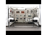
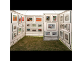
The session on a mock art fair jury was eye opening for me! I noted in my paragraph for the AFI contest for the ZAPP conference that I have tried to get into St. James but I've only been wait listed. My dear husband is encouraging me to apply to shows with fine art as the primary focus, within a 10 hour drive. I have been resisting applying to other "Go big or go home" shows because I have been using St. James as my barometer. First, I am guilty of having a booth shot taken at a fair that I thought looked nice.
I had no idea that jurors primarily want to see three walls with a gallery style hanging with no other distractions. In the back of my mind I knew some shows do not allow reproductions therefore print bins in the photo might be a strike. Items to make sure are not visible: chairs, desks, dolly, tubs peeking under the walls are all a distraction to the juror. Basically consider photographing your booth like you do your artwork: well lit, staged and very sterile. I also learned the sequence of the images can be a distraction. The submitted images need to be sequenced so that they are balanced in design, color and orientation.
Second, and this one caught me by surprise, some shows have open jury sessions! So an artist can attend and learn from the process. I don't yet know how to find which are open but that is on my to-do list. Third, the facilitator was the St. Louis art fair director and she said if you have questions about what a show is looking for in a booth shot or the type of work they focus on in their jury process - call the director and ask! For a painter like myself, I intend to make a list of shows I think suit my work and make some contacts before the application deadlines start rolling around for next year.
Other unexpected benefits to attending: I found a potentially new and cheaper insurance provider that covers artists, even at unpredictable weather outdoor events. I knew it was very important to protect our images by having watermarks or low res images online, but the Symposium- Imitation vs. Inspiration, I learned that the copyright protection laws are not guaranteed to protect us in this digital era. In this same session I gleaned, there are lots of differing opinions from those who make a living on the backs of artists about what is ethically acceptable in arenas of promoting and selling.
There were many other sessions that were more geared to the show promoters (both for profit and non-profit) yet they had much for an artist to absorb. We, as artists, are a part of a larger community effort in each of these fairs and it is up to us to decide if it fits our goals. Do you want to be at a huge festival where art is a small part of the experience but draws thousands? Maybe you want to focus on shows that where fine art is the focus.
For the seasoned artist who already has figured out their best shows and travels the entire country, maybe this conference would be a yawn for you. For emerging artists, I found there was much to absorb both from business development and the what future may hold for art fairs.
I met so many talented artists and people with a passion for creatives and I hope to stay in contact with them. I learned about new shows that may be a fit for my work. I found new resources to help me research fairs and grow my business. Thank you to all who put this conference together and thank you again Connie for the opportunity!
All the best,
Amy Welborn
 Review Booth Shot