Which is your jury image?

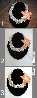
#1 is the original picture the jeweler took and has been submitting. It was taken with flash on the camera on a distracting background.
#2 is the new picture the jeweler took at my guidance. For the record, I did suggest a darker background.
#3 is #2 cropped and color and contrast corrected. Optimized for jurying.
It's not as much about what you like about the jury images as what the jurors see within 10 to 20 seconds. And it's not how good your images are, but how good your competitor's images are and how yours compare.
In the case of image #1, the jeweler didn't see anything wrong with because it (and similar images) got them into two shows last year. But they wanted to move up and apply to better shows that they haven't been able to get into.
In the case of image #2, it looked fine to them. And I was asked, though #3 looked a lot better, were the adjustments really necessary. How do you explain to someone what's necessary when they don't think it's worth investing to have a jury image that might actually get them into a show.
Larry Berman
http://BermanGraphics.com
412-401-8100
Replies
Larry,
How can you argue with informative and logical statements coupled with decades of experience from a master?
It was visually obvious which image was brighter and cleaner(catches the eye), the peach flower stood out and wasn't muted, the background in #3 made the necklace look purer on the black....etc..
We spend so much on application fees. Look at the big picture when you choose where to spend your money.
Go to one less mediocre show, get your photos done professionally and then be accepted next year to better shows.
Makes cents.