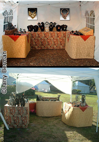
What does your booth slide look like? Which looks more like your booth, the top picture or the bottom picture. I photographed a set of jewelry the other day. The bottom picture was the jeweler's jury booth image. I walked her through setting up the booth in the top picture for jurying.
The windows in the side walls of her canopy are something she has to live with. They came with the canopy she purchased.
Larry Berman
http://BermanGraphics.com
412-401-8100

Replies
Mine is way overdue for re-doing. It was done about three years ago at a show, and by the descriptions I've read around here, it's too cluttered, wall papered with framed prints, a bunch of small stuff hung low that's tacky looking, no carpetting, and a red skirt around the flip bin table that glares out from the gray Pro panel walls. I've gotten rejected from Broad Ripple, Fourth Street in Bloomington, and AFB in Woodland Park, Lexington so far. I'll take the hint; the booth slide isn't just proof anymore that you have a stocked booth; it's a critical part of the jurying process and deserves as much effort as the jury images of the work itself.
1) Get the flip bin table out of there. Replace the red skirting with either gray or something more harmonious. In any event, that particular bin has been retired, although the skirting is used on the new table.
2) Get the little frame on the far left out of there.
3) No more than two large frames stacked vertically.
4) Either ditch the small frames on the right, or arrange them into a grouping that is cohesive and further up.
5) Eliminate the "closet" in the back, and have the walls run continuous all the way around.
6) Get some flooring down. My preference is for a blue indoor/outdoor carpetting.
I used a 15-30mm zoom at 15mm on this shot. The lens will cover 35mm format also. I've debated shooting film just to get the angle wider and open up the walls more. The trade off would be a reduction in image height of the back wall, but placing the largest pieces back there would offset that some, and the pieces on the sides would be more visible.
How much of an issue is glare on the glass?
Years ago I used to run fake ivy all around the edges of the canopy frame and across the center struts. Damn stuff would take a hour or so to put up, and I finally said to hell with it and no more frou-frou. I also had a long piece of muslin and made a hanging drape across the front of the booth and down the legs, and had curtain tie-backs. The place looked like a boudoir.
Your booth has to read well in under ten seconds. Actually all your jury images plus the booth needs to be easily read in that short time. I've attended two open juries where the timing for the first round of projected images was under ten seconds. Half the applicants were eliminated in round one.
Most of your own observations are accurate. Maybe not so much work hanging in the booth so the individual pieces have room to breath. Because of the low angle of your shot, it's difficult to tell it's even a flip bin because you didn't arrange the matted prints uniformly before shooting. They actually look interesting but it draws the jurors eyes for the wrong reason.
To eliminate glare, a fair number of photographers take the glass out of their frames before shooting a display picture.
I have a number of articles about it on my web site:
http://bermangraphics.com/artshows/booth-slide.htm
Larry Berman
http://BermanGraphics.com
412-401-8100
If the time frame to view all the slides is 10 seconnds, then it would seem that visually punchy images with simple and striking composition would be the best choice. So much for subtle work ;-/
I've been considering making gallery tags for the framed work to hang on the wall next to the work, but wouldn't that be too distracting for a booth slide?